Call-to-action (CTA) buttons are one of the most powerful elements on any website – yet most businesses unknowingly fail to use them effectively. Even beautifully designed sites struggle to convert if their CTAs are confusing, generic, or simply not aligned with what users actually want. At Sympley, we see this issue constantly, and the good news is: it’s almost always fixable with one simple shift in strategy.
Let’s break down why most CTA buttons fail – and the easiest way to turn them into conversion-boosting assets.
The Real Reason Most CTA Buttons Underperform
A CTA button’s only job is to guide a visitor toward taking the next logical step. But most CTAs don’t actually guide – they assume.
Common problems include:
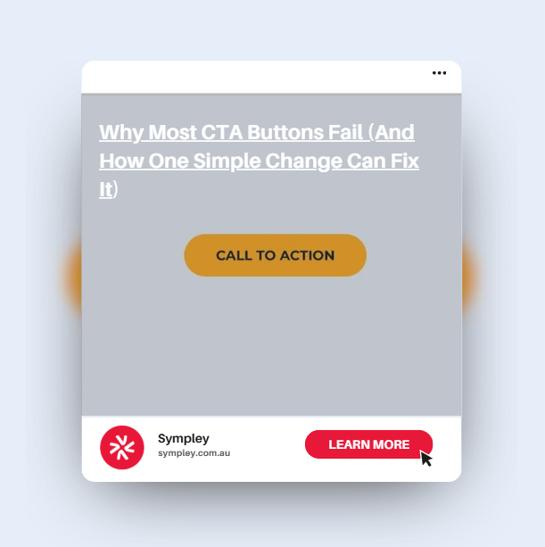
- Generic or vague wording: “Learn More” means nothing. Learn what?
- Too many CTAs competing for attention
- Poor placement that doesn’t match the user journey
- No understanding of user intent
- Buttons that blend into the design, making them easy to ignore
But the biggest issue? Most CTAs talk about the business – not the visitor’s goal.
Visitors don’t convert because you want them to. They convert when they feel the page aka the business YOU, understand their needs and lead them toward the outcome they want.
This is where traditional call-to-action buttons fall apart… and where a modern, outcome-driven CTA system wins every time.
The Simple Change That Fixes Everything: Ask Users What They Want
Instead of giving visitors a single static CTA, give them a way to tell you their goal – and guide them automatically to the right page.
This approach transforms a CTA from something you push at a visitor into something they choose for themselves. That one shift dramatically increases intent, clarity and engagement.
This is exactly why we here at Sympley created the Ultimate CTA plugin.
How Ultimate CTA Solves the CTA Problem
Ultimate CTA doesn’t just replace your button – it transforms it into an interactive, multi-option dropdown that asks your visitor:
“What do you need help with?”
From there, they choose an option that resonates with their goal, and the plugin instantly redirects them to the most relevant page.
This means your website:
- Speaks directly to each visitor’s intent
- Helps them self-navigate with zero friction
- Creates personalised journeys without needing dozens of separate CTAs
- Boosts confidence and trust (because the website feels tailor-made for them)
Whether you’re a service business, eCommerce store, or local specialist, this removes the guesswork and makes your site feel smarter.
User Intent Is the Missing Link in Most Website Designs
In our work managing & building literally hundreds of websites across WordPress & Shopify, we consistently find that businesses underestimate how important user intent is.
A visitor looking for pricing, vs. a visitor researching features, vs. a visitor needing support – each has a completely different path in mind.
Yet most websites give everyone the exact same button.
Ultimate CTA bridges that gap instantly.
Why This Works So Well
Interactive CTAs:
- Increase clarity
- Reduce bounce rates
- Improve conversions
- Match how people actually make decisions
- Make your site feel intuitive and user-friendly
A single dropdown CTA outperforms traditional buttons because it removes cognitive load. Instead of thinking about the next step, the visitor simply selects the one that suits them.
It’s simple, elegant, and incredibly effective.
Stop Guessing – Start Guiding
If your CTA buttons aren’t performing, it’s rarely a design problem. It’s a strategy problem.
The fastest way to fix it? Stop telling users what to do – and start letting them choose their goal.
That’s exactly what Ultimate CTA delivers, and why we recommend it for every website we work on.
See Ultimate CTA in action here: https://ultimatecta.com/
If you’re ready to increase conversions, create smarter user journeys, and improve your site long-term, Ultimate CTA is the simplest place to start.