Your home page is often the first impression someone has of your business. Naturally, many businesses want it to do everything: explain their services, build trust, answer questions and convince visitors to make an enquiry.
But here’s something worth considering: not every visitor is ready to enquire when they first arrive.
At Sympley, we believe one of the most effective ways to improve website conversions is to stop treating your home page as the final destination and start treating it as the beginning of a customer’s journey.
Instead of expecting every visitor to take the same action, help them find the next step that’s right for them.
Different Visitors Have Different Goals
Think about the people arriving on your website.
Some already know exactly what they need. Others are comparing options, researching solutions or trying to understand which service suits their situation.
A visitor looking for a new website has very different questions from someone who needs help maintaining an existing one.
Yet many home pages present everyone with the same generic call to action: “Contact Us” or “Get a Quote”.
While these buttons have their place, they don’t necessarily help visitors who aren’t ready to make contact.
A better approach is to give people clear choices based on what they’re trying to achieve.
Your Home Page Should Guide, Not Overwhelm
Trying to explain every service in detail on your home page can create unnecessary clutter.
Instead, focus on communicating what your business does, establishing credibility and directing visitors towards the most relevant information.
Your internal pages can then do the more detailed work.
For example, someone interested in ongoing website support could be directed to a dedicated WordPress maintenance service page.
Here, they can learn about website updates, security, monitoring and ongoing support without being distracted by unrelated services.
This creates a more focused experience where the content matches the visitor’s needs.
Replace Generic Buttons With Outcome-Based Choices
https://www.youtube.com/watch?v=Ow3psBtUgIc
One way to improve the visitor journey is to rethink your website’s main call to action.
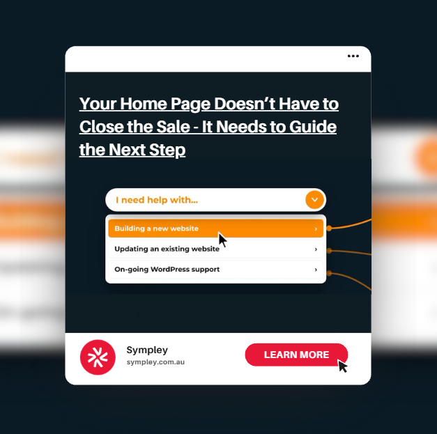
Rather than relying solely on a traditional “Contact Us” button, consider introducing a dropdown that asks visitors what they need help with.
For example:
I need help with…
- Building a new website
- Improving my website’s conversion rate
- Maintaining my WordPress website
- Growing my online store
- Getting more leads and enquiries
Each option links directly to a dedicated internal page addressing that particular need.
This is the concept behind Ultimate CTA, a WordPress plugin designed to help businesses offer multiple outcome-based pathways through a single dropdown call to action.
Instead of asking visitors to work out where to go next, you’re helping them make that decision.
Give Visitors the Information They Need Before Enquiring
A well-designed customer journey recognises that visitors may need more information before they’re comfortable getting in touch.
Dedicated internal pages provide space to answer common questions, explain your process, showcase relevant testimonials and address potential objections.
For example, someone considering a WordPress maintenance service might want to understand what’s included, how frequently updates are performed and what happens if something goes wrong.
Providing those answers on a relevant service page can help build confidence before asking for an enquiry.
The goal isn’t necessarily to get visitors to contact you immediately. It’s to help them move closer to making an informed decision.
A Clearer Journey Can Improve Conversion Opportunities
Website conversion optimisation isn’t always about making your call-to-action buttons bigger or more prominent.
Sometimes, the biggest improvement comes from making the next step easier to understand.
When visitors can quickly identify their desired outcome and access relevant information, they’re less likely to become frustrated navigating through unrelated content.
It also gives businesses an opportunity to create more targeted calls to action throughout their internal pages.
Your home page introduces the possibilities. Your internal pages explain the solutions. Your calls to action help visitors take the next step.
Together, they create a more purposeful customer journey.
Let Sympley Help You Create a Website That Converts
At Sympley, we help Australian businesses build websites that guide visitors towards meaningful actions, rather than simply presenting information and hoping for enquiries.
Whether you’re looking to improve your home page, create more effective service pages or introduce outcome-based navigation using tools like Ultimate CTA, we can help.
Get in touch with Sympley to discuss how we can improve your website’s visitor journey and turn more of your existing traffic into genuine enquiries.